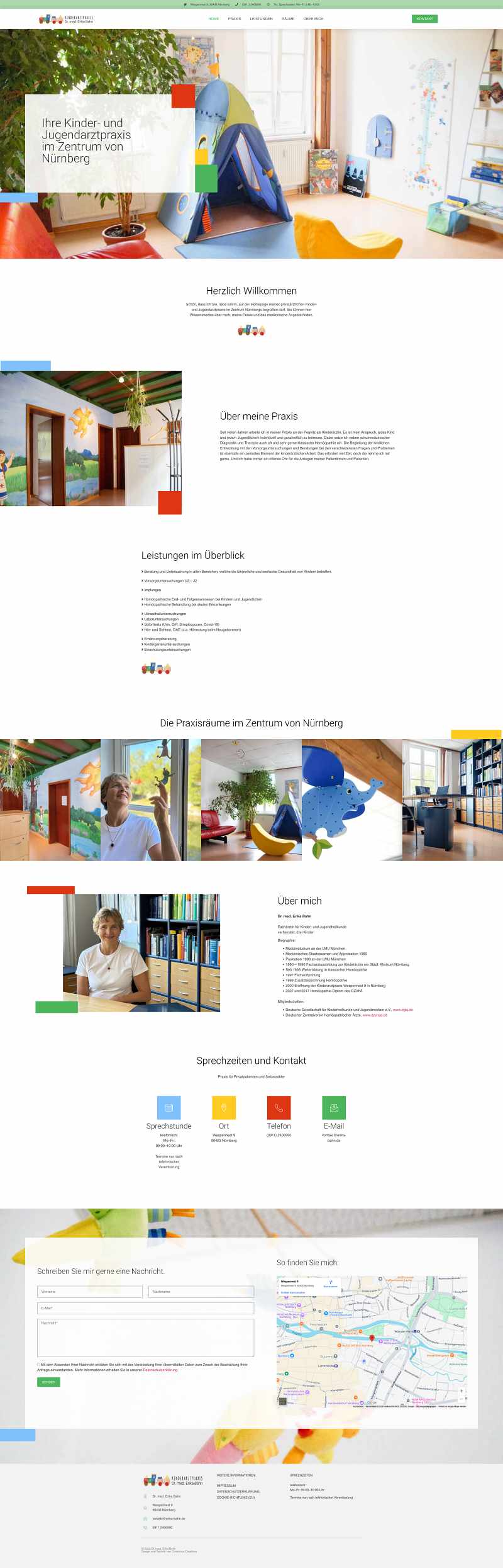
For the pediatrician Erika Bahn I was able to design a one-pager that reflects exactly what her practice is all about: empathetic, professional support for children and parents - with heart, mind and a lot of experience.
The aim was to create a web design that immediately inspires confidence. A site that looks friendly and competent - without frills, but with a lot of heart.
Why a one-pager for a pediatric practice?
A one-pager is often the perfect solution, especially for medical practices: parents who are looking for a new doctor for their child want to find their way around quickly. Who is she? How does she work? Is there a good connection to the little patients?
A one-pager bundles all important information on one page - clearly, directly and without detours. This saves time, creates clarity and offers exactly the space a practice needs to present itself authentically.
Target group-oriented web design - friendly, clear, approachable
The design is deliberately kept warm and bright. Clear lines, bright colors and an open structure make the site inviting and trusting for parents and children - just like a good first impression when entering the practice.
In terms of language, we have also made sure to meet parents at eye level. No technical jargon, no excess of information - but comprehensible, cordial and professional.
Authentically visible - with self-created photos
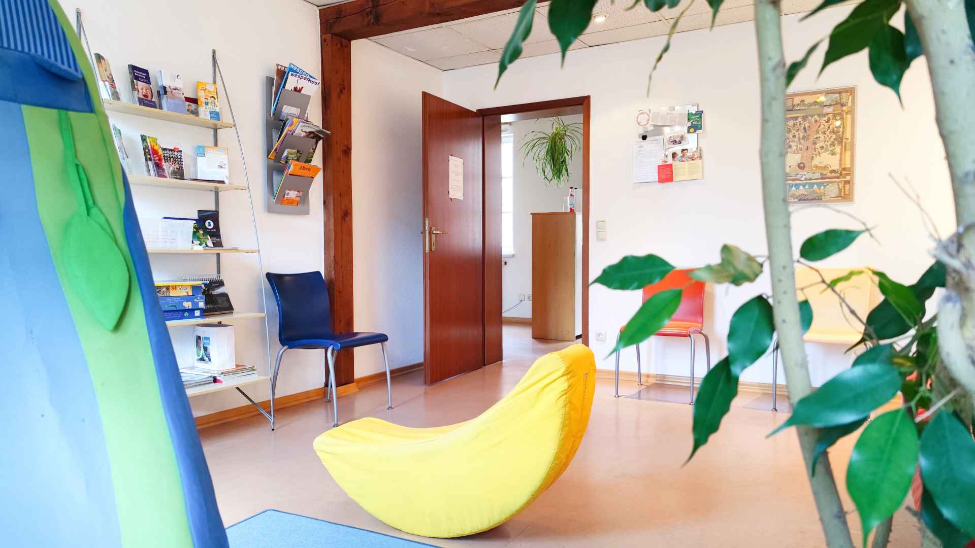
The site is made particularly personal by the self-recorded Practice photosthat I was allowed to create for Erika.
Whether practice rooms or detail shots - the pictures show what is important: a practice environment in which children can feel comfortable. No stock photos, no empty phrases - but real insights that create trust.
Colors
White space and lots of "colorful" images and colorful "wooden blocks" in the colors blue, yellow, green and red make up the web design of the site. Clear and informative, but also cheerful and somewhat playful, the site should reflect the friendliness and competence of Dr. Bahn as well as the playfulness of the little patients.
Typography
The chosen fonts should be clear and easy to read - and their clarity should suit Dr. Erika Bahn well.
Playfulness
In order to also reflect the little patients, the web design features bright colors on the page that look like "building blocks". In addition, a small iron "train" (with reference to Dr. Bahn's name) moves into the picture as an animation.
Conclusion:
The one-pager for Erika Bahn is an example of how web design can not only be beautiful, but also functional and empathetic. Especially in sensitive areas such as pediatrics, first impressions are crucial - and they can be just as coherent digitally as they are in real life.
Are you yourself a doctor, therapist or do you accompany people in your very own way?
I help you to become visible - clear, friendly and completely you.
Feel free to get in touch - I'm looking forward to your heart project.