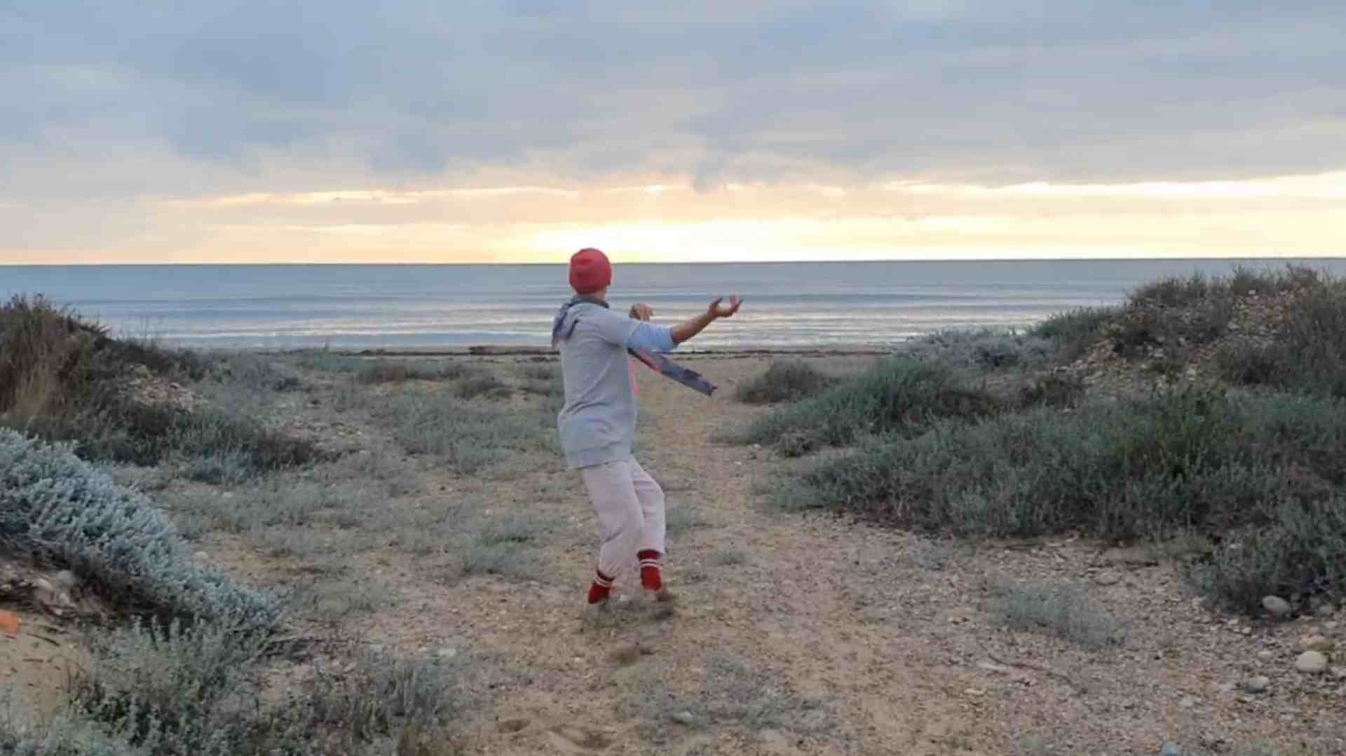
Minimalism meets expression - a website that leaves room for art
Art thrives on space. And of reduction.
For the website of lukasgeschwind.de I was able to create a mindful web design that consciously takes a step back - so that Lukas Geschwind's artistic power can take full effect.
The result: a puristic, uncluttered appearance in Black, white and graywhich does not put itself in the limelight, but provides the ideal background for art, coaching and personal depth.
Target group-oriented design - for art lovers & seekers
The site is aimed at people who are moved by art - both visually and emotionally. And to those who are looking for inner clarification, creative development or coaching impulses.
The web design appeals to this target group on several levels:
- through calm and structure
- through visual clarity
- through intuitive user guidance
There is nothing here that distracts. Everything that is there serves to express the content - and that is exactly what makes it so strong.
Minimalism as a stage for artistic depth
The focus is on the works and offers of Lukas Geschwind - not the design itself. That is why the entire appearance follows this motto: Less is more.
The selected colors - Black, white and shades of gray - create a neutral but elegant basis. They give the photos and videos of the artistic works room to unfold. Precisely because each project brings different color moods with it, the simple tones act like a calm resonance chamber.
The Typography follows this principle: minimalist, clear, modern. No frills, no loud effects - just the essentials.
Clear structure - art & coaching in balance
Lukas' work is divided into several fields - and this is exactly what is clearly and elegantly implemented in the navigation.
The main menu items "Art" and "Offerings" each lead to subpages that show the range of his work - from artistic projects to coaching offers.
This division enables visitors to quickly find what they are looking for, what Lukas offersand at the same time explore the depth of the content.


Tabs for an overview - gallery meets user-friendliness
The individual works of art and projects are clearly presented in Tabs displayed. This allows you to click intuitively through the themes - and let each work stand on its own.
Picture and video galleries complement the projects and bring the site to life. Particularly important: the media diversity is not weakened by the reduced web design - on the contrary. It is given the space it needs.
The blog - personal insights & artistic development
An integrated Blog rounds off the website. Here, Lukas shares impressions, describes events and provides deeper insights into his artistic path.
The blog creates a connection - it not only shows, what he does, but also how and why.
A powerful tool for people who are not only interested in results, but also in the people behind them.
Conclusion - digital presence with clarity and depth
This website is more than just a digital business card.
It is an expression of Lukas Geschwind's artistic and human attitude: genuine, clear, imbued with depth and stillness.
The web design emphasizes exactly that - through targeted reduction, fine typography and a visual language that speaks for itself.
If you have a creative or transformative offer yourself and would like a website that not overlaid, but strengthensthen get in touch with me. I don't just design pages - I design digital spaces that carry your essence.

