I was allowed to create this website for the Professional Association for Health Promotion e.V. an organization that is fully committed to improving health, prevention and quality of life. A website that builds trust, breaks down barriers and engages users both emotionally and in terms of content.
The goal was clear: a conscious, modern web designthat appeals to both specialist audiences, members, multipliers and interested citizens. Serious, but not stiff. Friendly, accessible and open to diversity. A place for exchange and information - digital and yet personal.
Target group-oriented web design - structure meets vibrancy
Mindful web design for me means thinking about the people who use the site - with very different backgrounds, technical devices and needs. That's why the design was specifically adapted to the requirements of an association that works professionally but still wants to remain accessible.
The Colors play a central role in this:
- Petrol stands for depth, trust and stability - perfect for an organization that works on a sound basis.
- Green symbolizes growth, vitality and health - and gives the site exactly the fresh impetus that health promotion deserves.
These colors are not only found in the logo, but are deliberately used throughout the entire design: in buttons, headlines, icons and accents. This ensures visual recognizability and strengthens the branding.
The logo lives on in the web design - visual identity with depth
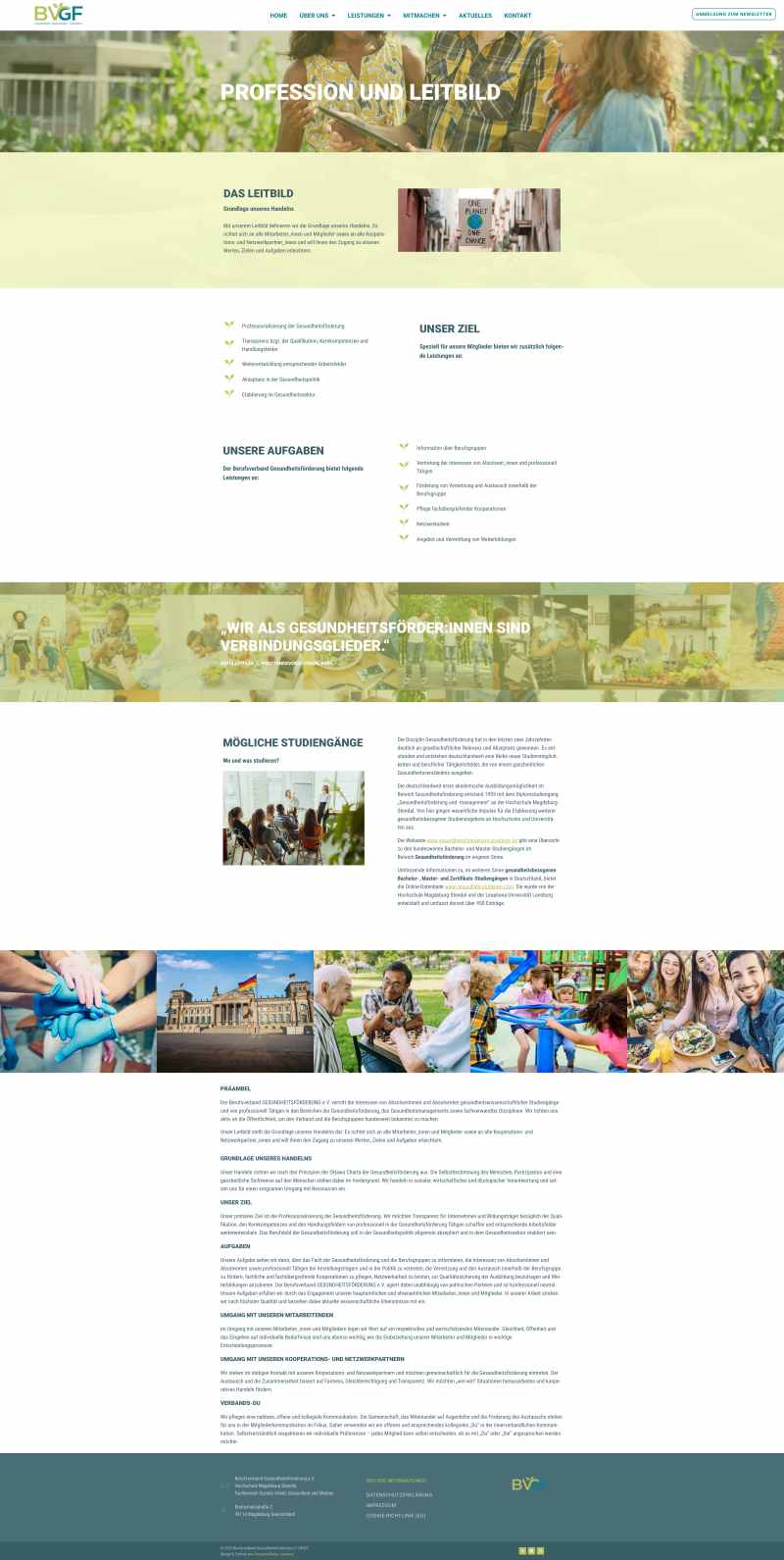
A special detail: the design picks up Design elements of the logo especially the two green leaves. These appear again and again in a very subtle but effective way:
- As Bullet points in lists, they create a natural, appealing look.
- When changing pages, the two sheets as preloader animation - a small, loving detail that creates lightness and recognition.
This creates a design context that goes far beyond the homepage. The logo is not just a static brand - it becomes part of the movement, part of the digital experience.
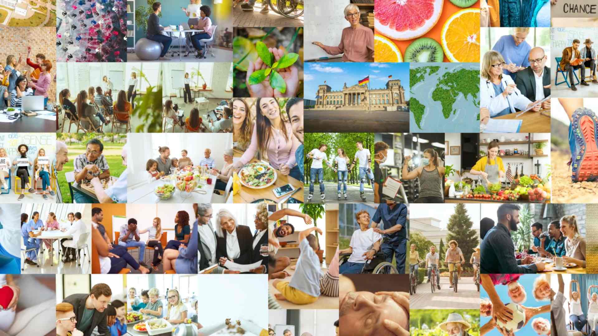
Visual storytelling with your own intro video
A highlight of the homepage is the self-designed and edited Intro video. It welcomes visitors as soon as they enter the site - with strong images, real encounters and a clear message: health promotion is collaborative, dynamic and future-oriented.
The video connects people, places and activities - and ends with the harmonious unfolding of the logo. This not only generates attention, but also establishes an emotional connection to the association.
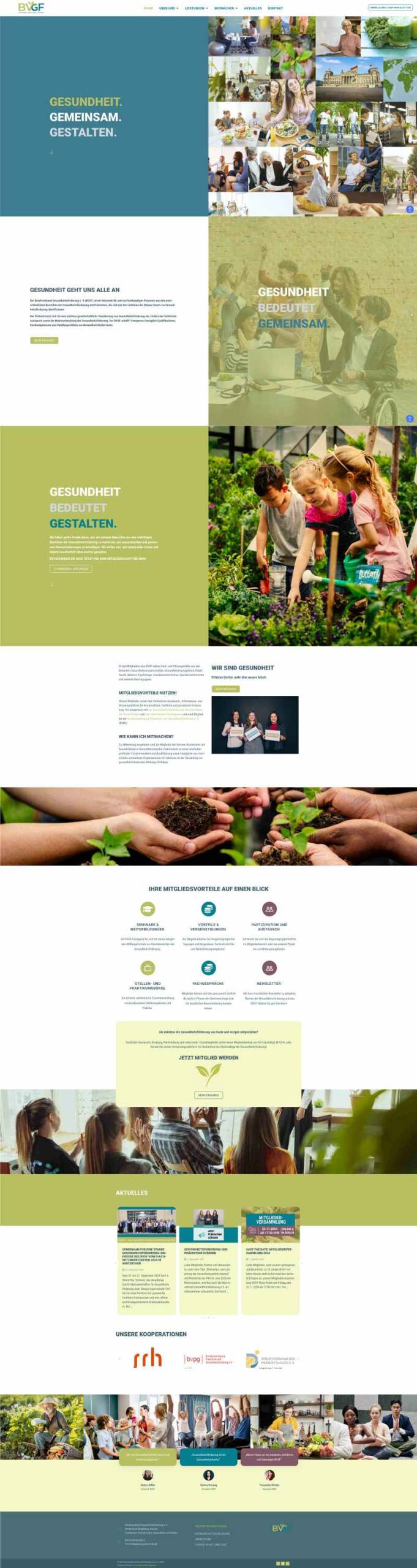
Clear structure and intuitive navigation
The site structure is deliberately kept simple, with a clear menu navigation that makes all relevant areas quickly accessible - from "About us" and "Membership" to "Projects" and "Contact".
Especially when it comes to web design for clubs, it is important to Quick to find and present it in an understandable way. Visitors should not have to search - they can arrive, click and understand.
News & Events - the dynamic blog page
Another centerpiece of the website is the News page - New contributions are regularly posted here, Event information, Press releases and Project insights published.
This brings the site to life - and also provides valuable SEO content.
Search engines love regularly updated content. And users know that: This organization is active, moving, shaping. The blog structure is clearly organized and allows easy filtering by topic.
Barrier-free & mobile-friendly - inclusive design
A mindful web design thinks along with everyone: That's why the website was designed Accessibility checked. Color contrasts, font sizes, understandable language and mobile readability were taken into account in order to reach as many people as possible.
The site works smoothly on smartphones, tablets and desktops - including a responsive menu, click-friendly buttons and adapted image formats. This is essential for a professional association - because it communicates with people from all over Germany, in a wide variety of contexts.
With a feel for the essentials
For me, this project shows what conscious web design really means: a well thought-out space that carries content, reflects identity and connects people.
The design not only conveys information, but also Posture. It shows that health promotion is not dry or theoretical, but lively, human and deeply rooted in real life.
Conclusion: Web design for clubs - empathetic, functional, visible
The website of the Bundesverband für Gesundheitsförderung e.V. is an example of the Modern digital presence of an association in transition. It unites Clarity, liveliness and recognitionwithout getting lost in effects.
It shows how design can be professional and human at the same time - structured and yet flexible, target group-oriented and yet personal.
Is your project already waiting?
Do you want a website for your club, association or initiative that works? One that not only looks good, but also communicates clearly and touches people? Then let's design it together - mindful, conscious and genuine.
Get in touch with me - I am looking forward to our project.