As a designer, I love it when design is holistic - when it shows attitude, speaks clearly, stands for something. The new Web design for Durchbruch e.V. aus Berlin ist genau so ein Projekt. Es vereint minimalistisches Design mit maximaler Wirkung – und trägt die starke Botschaft des Vereins in die digitale Welt.
Durchbruch e.V. is a Berlin-based association that stands up for young people living in difficult social circumstances. The mission: to help young people make their own breakthrough - courageously, loudly, self-determined. And it is precisely this feeling that I have made visible in the web design.
Web design with attitude - digital space for movement
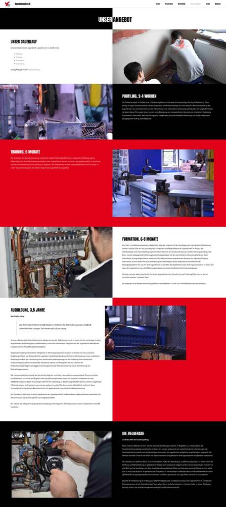
The web design of Durchbruch e.V. sees itself as a stage for engagement - a digital space that makes movement visible. The home page looks like a manifesto: large headlines, reduced color accents and strong contrasts pick up visitors directly. The navigation is kept lean so that content can be found quickly - particularly important for young people who want to find their way around. Behind every page is a well thought-out flow that conveys both information and emotion. No unnecessary ballast, no distractions. Instead, clear structures, bold design and a very unique tone: direct, lively, authentic. The result is a website that not only shows content, but also communicates attitude - entirely in the spirit of the association.
Web design for NGOs & associations - authentic and effective
When I design websites for NGOs or non-profit organizations, I don't just think in pixels. I feel: Who are you really? What moves you? How can your vision become tangible through design?
Durchbruch e.V. stands for social participation, empowerment and the strength of young people. The web design picks up on exactly that:
Clearly structured, Quick to grasp, to the point. But not arbitrarily. But with attitude and passion.
I love working with non-profit organizations because I see design as a tool for change. Because websites Unfold effect can - if they are honest, focused and designed with meaning.

Reduction meets action: colors & typography
Das bestehende Corporate Design des Vereins aus Berlin war die Basis – und ich habe es bewusst weitergedacht. Im Zentrum steht ein minimalistischer Ansatz:
- Black and white dominate as neutral poles. They alternate in high contrast and create clarity.
- Red brings energy into play - it stands for action, commitment, new beginnings. It deliberately shines at certain points - a visual impulse that shakes things up.
The Typography is a clear statement: Big. Bold. Direct.
It conveys what the association stands for: Courage, visibility, breakthrough. This is particularly evident in the headlines: no whispering, no hesitation - but the visual equivalent of a megaphone. Yet everything remains structured, easy to read and accessible.
Mindful web design - what does that actually mean?
I believe that design can be mindful. That it must breathe. Leave room.
That's why I worked with a lot of white space, with deliberate pauses and calm layouts. A counterpoint to the urgency of the contentthat provides orientation.
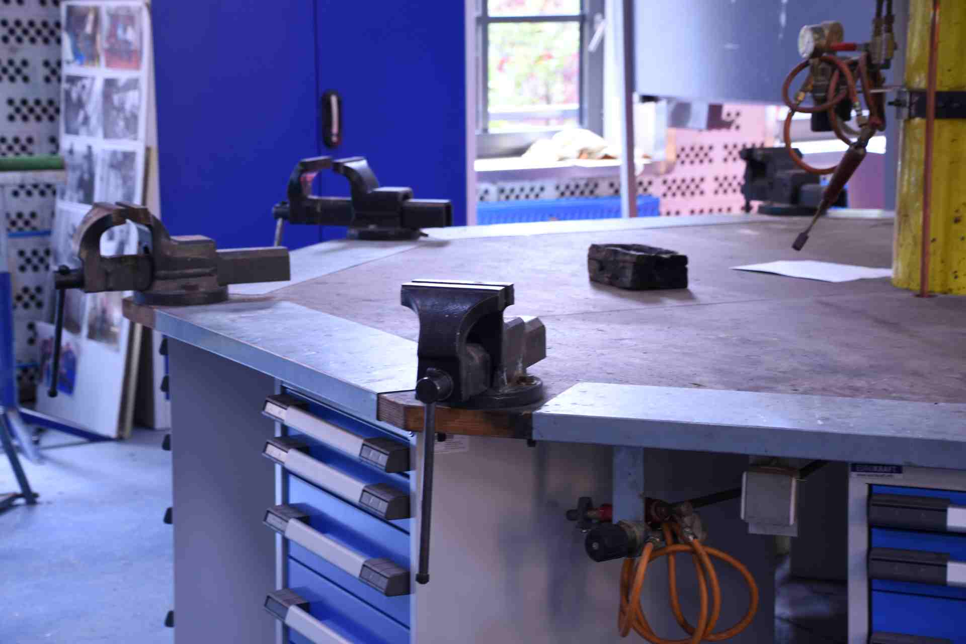
The imagery has also been carefully selected: Authentic, real photos of young people, workshops, action days. No stock photos, no slick perfectionism.
Because Durchbruch e.V. is real. And that's exactly what the site is supposed to show.
Target group-oriented design: For young people and supporters
The website is aimed at different target groups:
On the one hand young peoplewho want to get involved or get support. On the other hand Sponsors, cooperation partners and specialist audience.
This balance is reflected in the design:
- For young peoplestrong colors, clear language, direct approach, easy navigation.
- For supportersClear project information, insights, contact options and a professional look that creates trust.
The result is a website that builds bridges - between worlds, between target groups, between action and awareness.
Conclusion
If you are an association, NGO or social initiative looking for a web design that fits your mission - let's talk.
I accompany you with ideas, clarity, empathy and the ability to translate your essence into a visual language.
Because mindful web design for me means: creating a design that not only looks good - but also touches, connects and makes tangible what you really care about.