A place for inner peace - as a visual experience to feel and breathe deeply.
With the web design for freiraum-fuer-achtsamkeit.de a project has been created that not only makes things visible online, what mindfulness meansbut makes it tangible.
The website was specially developed for an MBSR (Mindfulness-Based Stress Reduction) trainer and combines the principles of mindfulness with a finely tuned design.
This web design for MBSR offers creates trust, has a decelerating effect and appeals specifically to people who want to integrate mindfulness into their lives.
This was about more than design - it was about creating a digital space that Vastness, sensitivity and silence radiates. An invitation to meet yourself.
Mindfulness made visible - the design
The entire web design was created with a clear intention: Mindful, light and sensitive. From the very first scroll, you can feel that this page is breathing more slowly.
The used Watercolor tones - delicate lavender nuances combined with fresh green - leave room for lightness, liveliness and depth. They have not been chosen at random: They reflect the color frequencies that give calm and inspire at the same time.
Purple stands for transformation, introspection and spirituality.
Green brings grounding, nature, heart opening.
The two colors meet in a playful dance of soft watercolor blotchesembedded in an airy layout with plenty of white space. It is precisely this white space that creates what is so rare these days: Room to pause for thought.
The Photo selection emphasizes the theme - with authentic shots of nature, delicate textures and light-filled moments. No loud imagery, but genuine, quiet power.
Logo with depth - the lotus as a symbol
Also the Logo was developed individually and is a central component of the new brand identity.
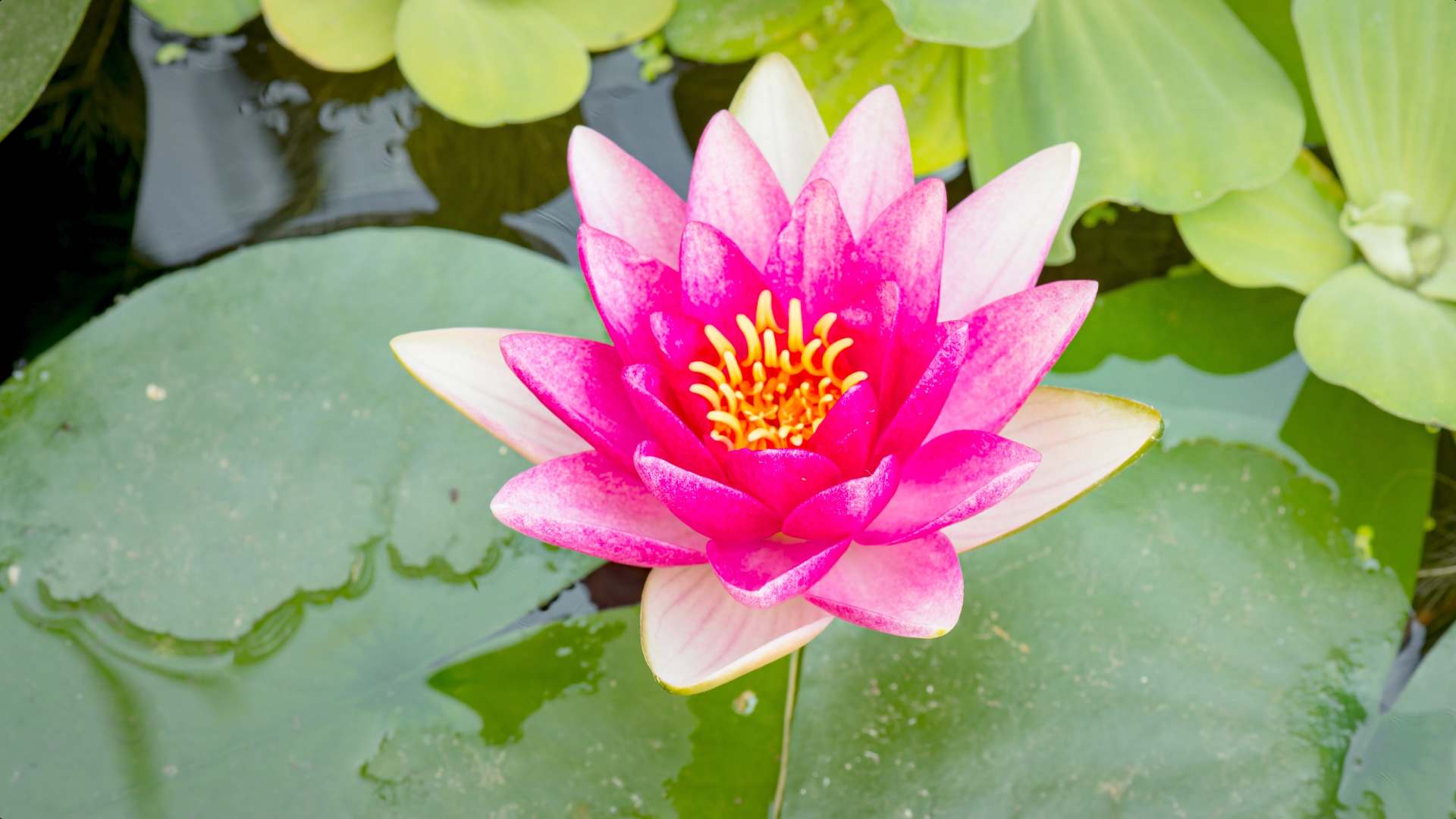
In the center: a stylized Lotuswhich - like the human being on his mindful path - slowly unfolds. The lines are soft, organic, almost meditative.
The logo is made particularly harmonious by the embedded Video of an opening water lilywhich can be seen on the homepage of the website. In a gentle time lapse, page after page opens up - just like the human being in the process of becoming conscious.
This moving image not only picks up on the logo visually, but also deepens the emotional impact of the page. A poetic bridge between design and inner process.
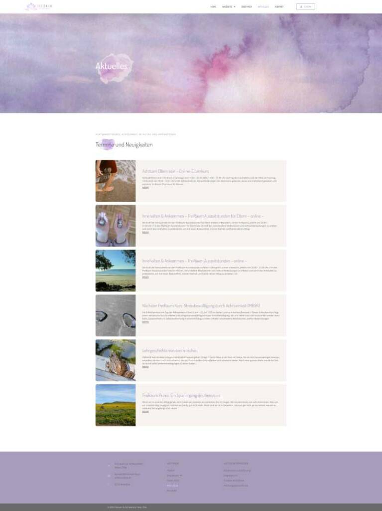
The blog - inspiration for everyday life
The website is supported by an integrated Blog not as a pure news section, but as a lively space for impulses.
Here you will find:
- Dates for mindfulness courses and events
- Everyday inspiration for more presence and self-care
- Thoughts that touch - not lecture
A place where not only information is conveyed, but where Consciousness shared will.
Business cards & overall image - a harmonious whole
In addition to the website and logo, the new brand world also includes Business cardswhich continue the design concept offline.
Here too: Watercolor tones, clear typography, lots of air. A card layout that doesn't scream, but rather invites. It remains true to the red line: Authentic. Genuine. Mindful.
Conclusion - a project with soul
"Freiraum für Achtsamkeit" is more than just a web design project. It is a visual meditation become.
A digital invitation to take a conscious look - and discover yourself in it.
If you are looking for a website that gives space to your essenceyou and your work, then get in touch with me. I don't just design pages for you, but Digital rooms with heart.