A place for inner calm – a visual experience to feel and breathe.
The web design for freiraum-fuer-achtsamkeit.de is a project that not only makes visible online what mindfulness means, but also makes it tangible.
Die Website wurde speziell für eine MBSR-Trainerin (Mindfulness-Based Stress Reduction) entwickelt und verbindet die Prinzipien der Achtsamkeit mit einem fein abgestimmten Design.
Dieses Web design für MBSR-Angebote schafft Vertrauen, wirkt entschleunigend und spricht gezielt Menschen an, die Achtsamkeit in ihr Leben integrieren möchten.
It was about more than design – it was about creating a digital space that radiates expansiveness, sensitivity, and silence. An invitation to meet oneself.
Mindfulness made visible – the design
The entire web design was created with a clear intention: mindful, light, and sensitive. Even with the first scroll, you can feel that this page breathes more slowly.
The watercolor tones used – delicate lavender shades combined with fresh green – create space for lightness, liveliness, and depth. They are not chosen randomly: they reflect the color frequencies that provide calm and also inspire.
Purple steht für Transformation, Innenschau, Spiritualität.
Grün bringt Erdung, Natur, Herzöffnung.
The two colors meet in a playful dance of gentle watercolor splashes, embedded in an airy layout with plenty of white space. This white space creates what is so rare in today's time: space to pause.
The choice of photos underscores the theme – with authentic nature shots, delicate textures, and light-filled moments. No loud imagery, but real, quiet strength.
Logo with depth – the lotus as a symbol
The logo was also individually developed and is a central part of the new brand identity.
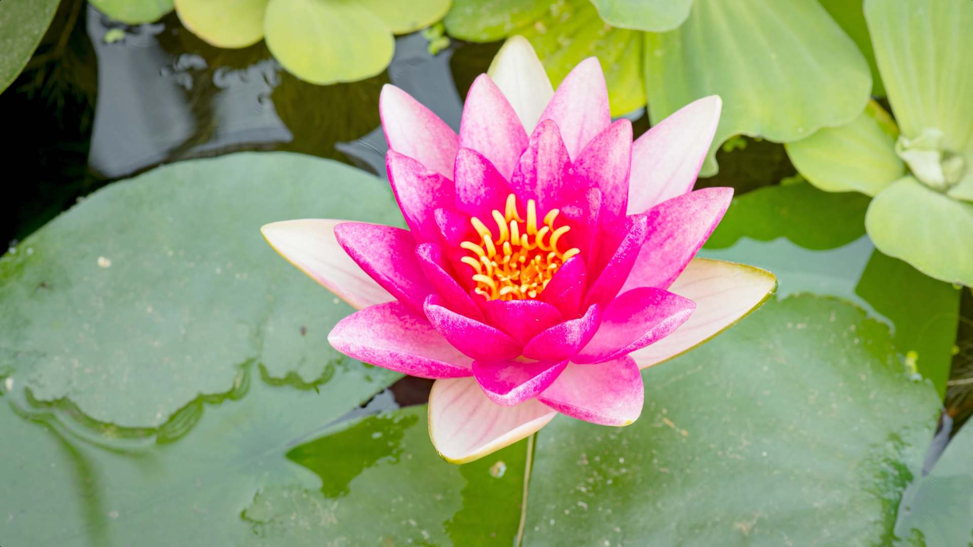
At the center: a stylized lotus that unfolds slowly – like a person on their mindful path. The line work is soft, organic, almost meditative.
The logo is particularly harmonious due to the embedded video of a blooming water lily, which can be seen on the homepage of the website. In a gentle time-lapse, it opens leaf by leaf – just like a person in the process of becoming aware.
This moving image not only visually picks up the logo but also deepens the emotional impact of the page. A poetic bridge between design and inner process.
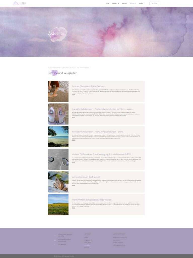
The blog – inspiration for everyday life
The website is complemented by an integrated blog – not as a pure news section, but as a living space for impulses.
Hier findest du:
– Termine zu Achtsamkeitskursen und Veranstaltungen
– Alltagstaugliche Inspirationen für mehr Präsenz und Selbstfürsorge
– Gedanken, die berühren – nicht belehren
A place where not only information is conveyed, but consciousness is shared.
Business cards & overall image – a harmonious whole
The new brand world includes not only the website and logo but also business cards that continue the design concept offline.
Here too: watercolor tones, clear typography, lots of air. A card layout that does not shout but invites. It remains true to the red thread: Authentic. Real. Mindful.
Conclusion – a project with soul
„Freiraum für Achtsamkeit“ ist mehr als ein Web design-Projekt. Es ist eine visuelle Meditation geworden.
Eine digitale Einladung, bewusst hinzusehen – und dich selbst darin zu entdecken.
If you are looking for a web presence that gives space to your essence, reflects you and your work, then feel free to contact me. I create not just pages for you, but digital spaces with heart.