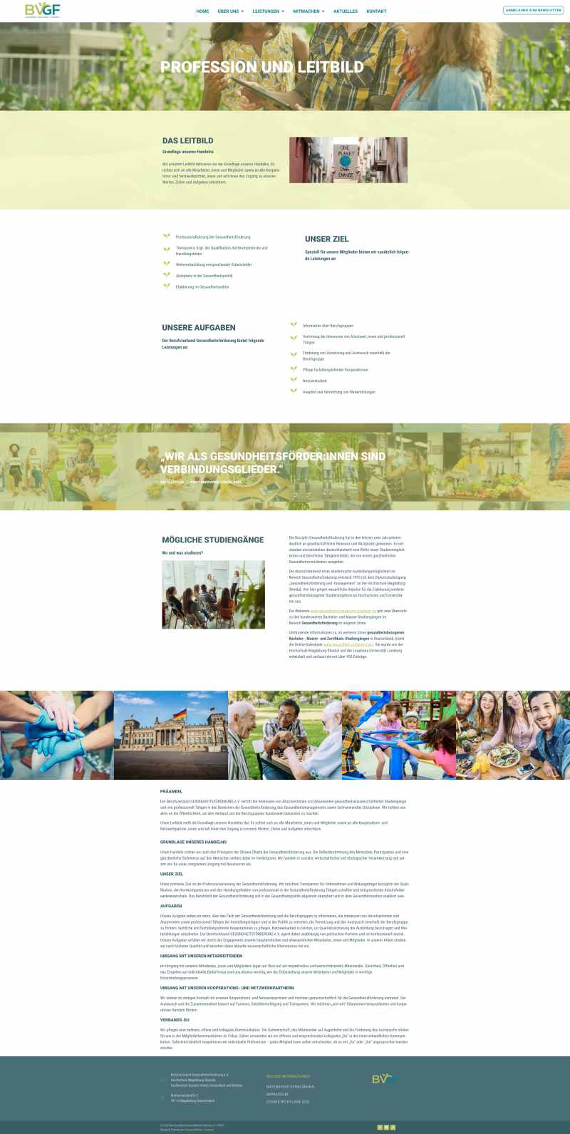
I had the privilege of designing this website for the Professional Association for Health Promotion e.V. – an organization that works tirelessly for more health, prevention, and quality of life. A website that builds trust, breaks down barriers, and engages users both emotionally and content-wise.
The goal was clear: a conscious, modern web design that appeals to professionals, members, multipliers, and interested citizens. Serious, but not stiff. Friendly, accessible, and open to diversity. A place for exchange and information – digital yet personal.
Target group-oriented web design – structure meets liveliness
Mindful web design means considering the people who use the site – with very different backgrounds, technical devices, and needs. Therefore, the design was specifically tailored to the requirements of an association that works professionally but still wants to remain accessible.
The colors play a central role:
- Petrol represents depth, trust, and stability – perfect for an organization that works on solid foundations.
- Green symbolizes growth, liveliness, and health – and gives the site exactly the fresh impulse that health promotion deserves.
These colors are not only found in the logo but are consciously integrated throughout the entire design: in buttons, headings, icons, and accents. This creates visual recognition and strengthens the branding.
The logo continues to live in web design – visual identity with depth
A special detail: The design incorporates elements of the logo – especially the two green leaves. These appear in a very subtle yet effective way again and again:
- As bullet points in lists, they provide a natural, friendly look.
- When changing pages, the two leaves appear as a preloader animation – a small, loving detail that creates lightness and recognition.
This creates a design connection that goes far beyond the homepage. The logo is not just a static brand – it becomes part of the movement, part of the digital experience.
Visual storytelling with its own intro video
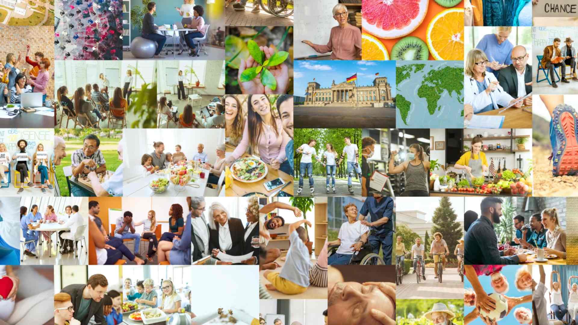
A highlight of the homepage is the self-conceived and edited intro video. It welcomes visitors directly upon entering the site – with strong images, real encounters, and a clear message: health promotion is communal, dynamic, and future-oriented.
The video connects people, places, and activities – and ends with the harmonious unfolding of the logo. This not only generates attention but also builds an emotional connection to the association.


Clear structure and intuitive navigation
The page structure is deliberately kept simple, with a clear menu that makes all relevant areas quickly accessible – from 'About Us' to 'Membership' to 'Projects' and 'Contact'.
Especially in web design for associations, it is important to present content quickly findable and understandable. Visitors should not have to search – they should be able to arrive, click, and understand.
News & Events – the dynamic blog page
Ein weiteres Herzstück der Website ist die Aktuelles-Page – hier werden regelmäßig neue Beiträge, Veranstaltungshinweise, Pressemitteilungen und Projekteinblicke veröffentlicht.
Das sorgt für Lebendigkeit auf der Page – und ganz nebenbei auch für wertvollen SEO-Content.
Search engines love regularly updated content. And users know: This organization is active, moving, and shaping things. The blog structure is kept clear and allows for easy filtering by topics.
Accessible & mobile-friendly – inclusive design
Mindful web design considers everyone: Therefore, the website was checked for accessibility from the beginning. Color contrasts, font sizes, understandable language, and mobile readability were taken into account to reach as many people as possible.
The site works smoothly on smartphone, tablet, and desktop – including responsive menu, click-friendly buttons, and adapted image formats. For a professional association, this is essential – as it communicates with people from all over Germany in various contexts.
With a sense for the essential
This project shows me what mindful web design really means: a thoughtful space that carries content, reflects identity, and connects people.
The design conveys not only information but also attitude. It shows that health promotion is not dry or theoretical, but lively, human, and deeply rooted in real life.
Conclusion: Web design for associations – empathetic, functional, visible
The website of the Federal Association for Health Promotion e.V. is exemplary of the modern digital presence of an association in transition. It combines clarity, liveliness, and recognition without losing itself in effects.
It shows how design can be both professional and human – structured yet flexible, target group-oriented yet personal.
Your project is already waiting?
Do you want a website for your association, organization, or initiative that works? One that not only looks good but communicates clearly and touches? Then let's design together – mindfully, consciously, and authentically.
Get in touch with me – I look forward to our project.

