Minimalism meets expression – a website that leaves space for art
Kunst lebt von Raum. Und von Reduktion.
Für die Website von lukasgeschwind.de durfte ich ein achtsames Web design erschaffen, das sich bewusst zurücknimmt – damit die künstlerische Kraft von Lukas Geschwind in voller Präsenz wirken kann.
The result: a puristic, tidy appearance in black, white, and gray that does not take center stage but provides the ideal background for art, coaching, and personal depth.
Target group-oriented design – for art lovers & seekers
The site is aimed at people who are touched by art – visually and emotionally. And at those who are looking for inner clarity, creative expression, or coaching impulses.
Das Web design spricht diese Zielgruppe auf mehreren Ebenen an:
– durch Ruhe und Struktur
– durch visuelle Klarheit
– durch eine intuitive Userführung
There is nothing here that distracts. Everything that is there serves the expression of the content – and that is exactly what makes it so strong.
Minimalism as a stage for artistic depth
The focus is on the works and offerings of Lukas Geschwind – not the design itself. Therefore, the entire appearance follows the principle: Less is more.
The chosen colors – black, white, and shades of gray – create a neutral but noble basis. They allow the photos and videos of the artistic works space to unfold. Precisely because each project brings different color moods, the simple tones act as a calm resonance space.
The typography also adheres to this principle: minimalist, clear, modern. No flourishes, no loud effects – just the essentials.
Clear structure – art & coaching in balance
Lukas's work is divided into several fields – and this is implemented clearly and elegantly in the navigation.
The main menu items 'Art' and 'Offerings' each lead to subpages that show the range of his work – from artistic projects to coaching offerings.
This division allows visitors to quickly grasp what Lukas offers while exploring the depth of the content.


Tabs for overview – gallery meets user-friendliness
The individual artworks and projects are clearly presented in tabs. This way, you can intuitively click through the topics – and let each work stand on its own.
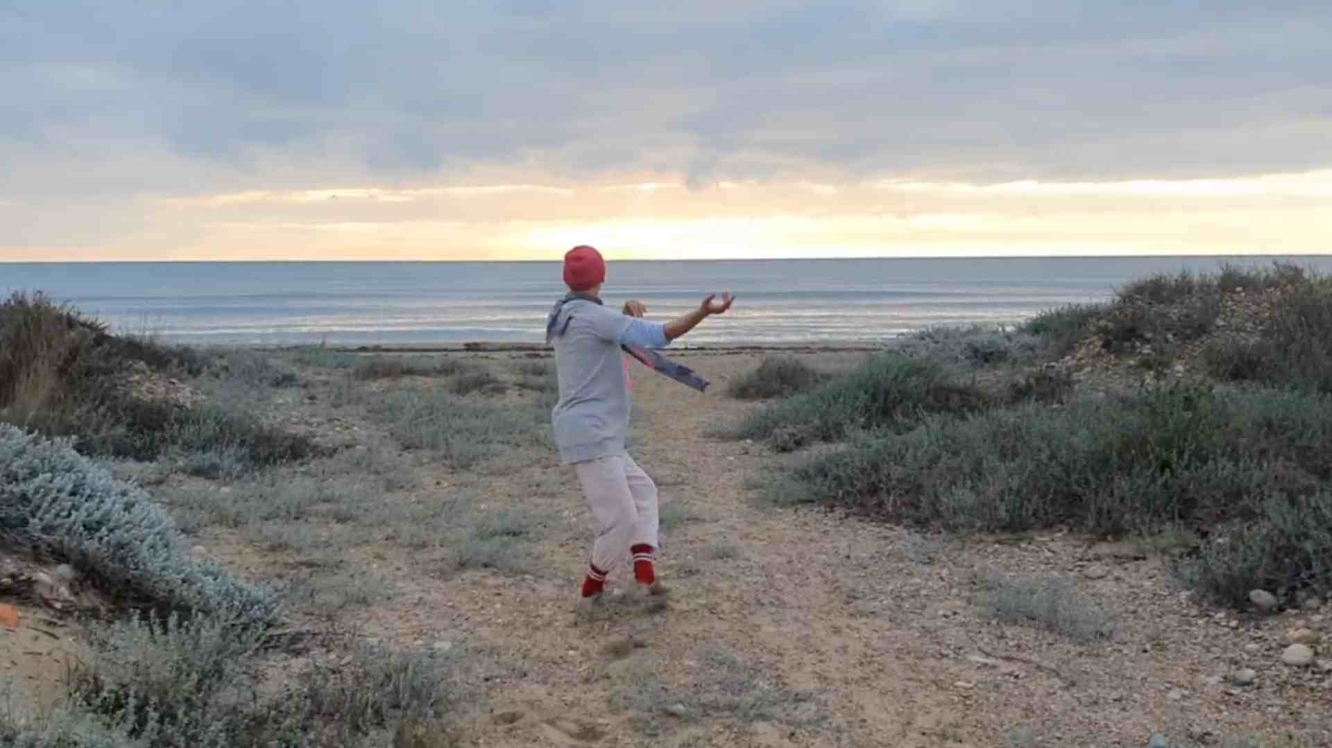
Image and video galleries complement the projects and bring the site to life. Especially important: The media diversity is not weakened by the reduced web design – on the contrary. It gets the space it needs.
The blog – personal insights & artistic development
An integrated blog rounds off the website. Here, Lukas shares impressions, describes events, and provides deeper insights into his artistic journey.
Der Blog schafft Verbindung – er zeigt nicht nur, was er tut, sondern auch wie und warum.
Ein starkes Tool für Menschen, die sich nicht nur für Ergebnisse interessieren, sondern auch für den Menschen dahinter.
Conclusion – digital presence with clarity and depth
Diese WebPage ist mehr als eine digitale Visitenkarte.
Sie ist ein Ausdruck von Lukas Geschwinds künstlerischer und menschlicher Haltung: echt, klar, durchdrungen von Tiefe und Stille.
The web design highlights exactly that – through targeted reduction, fine typography, and a visual language that speaks for itself.
If you have a creative or transformative offering and wish for a website that does not overshadow but strengthens, then get in touch with me. I don't just create pages – I create digital spaces that carry your essence.