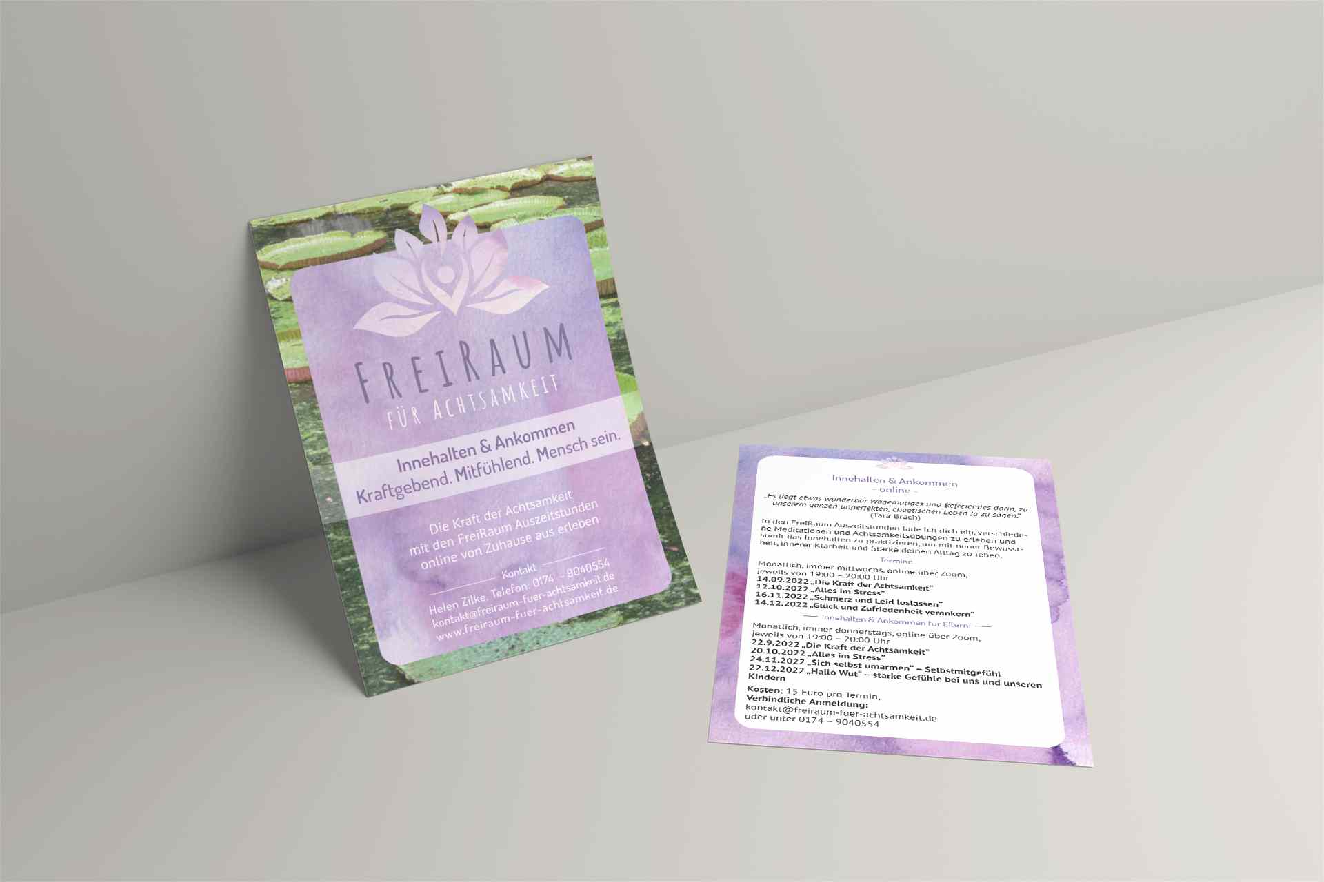
When I set out to design this flyer for mindfulness coaching, my aim was to embody the essence of mindfulness and calm - a reflection of what "Freiraum für Achtsamkeit" stands for. With a harmonious play of colors and thoughtful design elements, I wanted to create a visual invitation to inner peace and self-awareness.
The front of the flyer entices with a serene color palette, where I carefully blended shades of calming purple with the natural green of a zen garden. The centerpiece is the logo of "Freiraum für Achtsamkeit", a beautifully stylized lotus flower, a universal symbol of purity and enlightenment.
I chose the two fonts for their clarity and softness. The headlines pick up on the typography of the logo, soft, clear and feminine. The text font is clear, easy to read and reduced.
If you turn the flyer over, you will find a continuation of the reassuring theme. The text layout is well thought out to ensure a clear and engaging flow of information. Each workshop and offering is carefully described to guide potential participants through a variety of opportunities for personal growth and reflection. The use of space and alignment ensures that the content is not only informative, but also enjoyable to read.
This flyer was not just a project, but also a declaration of love for the art of visual storytelling: a gateway to a world of mindfulness. I relish the opportunity to bring elements like this together for clients, and I look forward to creating many more pieces that speak to the heart and mind.
The logo, business cards and website were also created here.